Successful direct mail campaigns prioritize Design. Your advertising layout, the style, shape and tone of your commercial message are important factors in successfully pitching your goods and services. The colours you select, the images and text are all part of a delicate balancing act governed by a mixture of common sense and practical design rules.
What are Print Ads?
Print advertising is as old as print media which is timeless. The graffiti found in Roman ruins, chalked on walls two thousand years ago is hard proof that print ads have staying power. Commercial messages have always appeared in newspapers, magazines, direct mail, and billboards. Print ads are used to promote commerce and attract more customers. The format is engineered to capture consumers’ attention as they drive to work, read their favourite publications or receive their mail.
Best Content for Print Ads
Professional copywriters pride themselves on their ability to communicate a deal succinctly while inspiring a positive reaction in consumers. Unless requested, they won’t use slang, overly technical or foreign words, or anything which is distracting. When your prospective buyers are reading your sales copy they're trying to decide whether or not your goods or services are a fit for them, and so you don’t want to pollute their brains with weird words or do anything which obscures the deal. You want every line of your copy to flow seamlessly into the next, without interruption.
Less is more and certain words and phrases have additional meanings. Two-for-one means the price of a single item likely hasn’t changed. Satisfaction guaranteed means there must be a buy-back program in place should a consumer not feel satisfied. Present Coupon upon Purchase means the print media is meant for in-store shopping and there’s unlikely to be any receiving mechanism for online sales.
Grammar and spelling are important in commerce. Marketers should proofread twice and have someone with fresh eyes read their sentences aloud before the piece is published. It’s a tragedy when a well conceived advertisement leaves a poor impression because of an overlooked and easily fixed error.
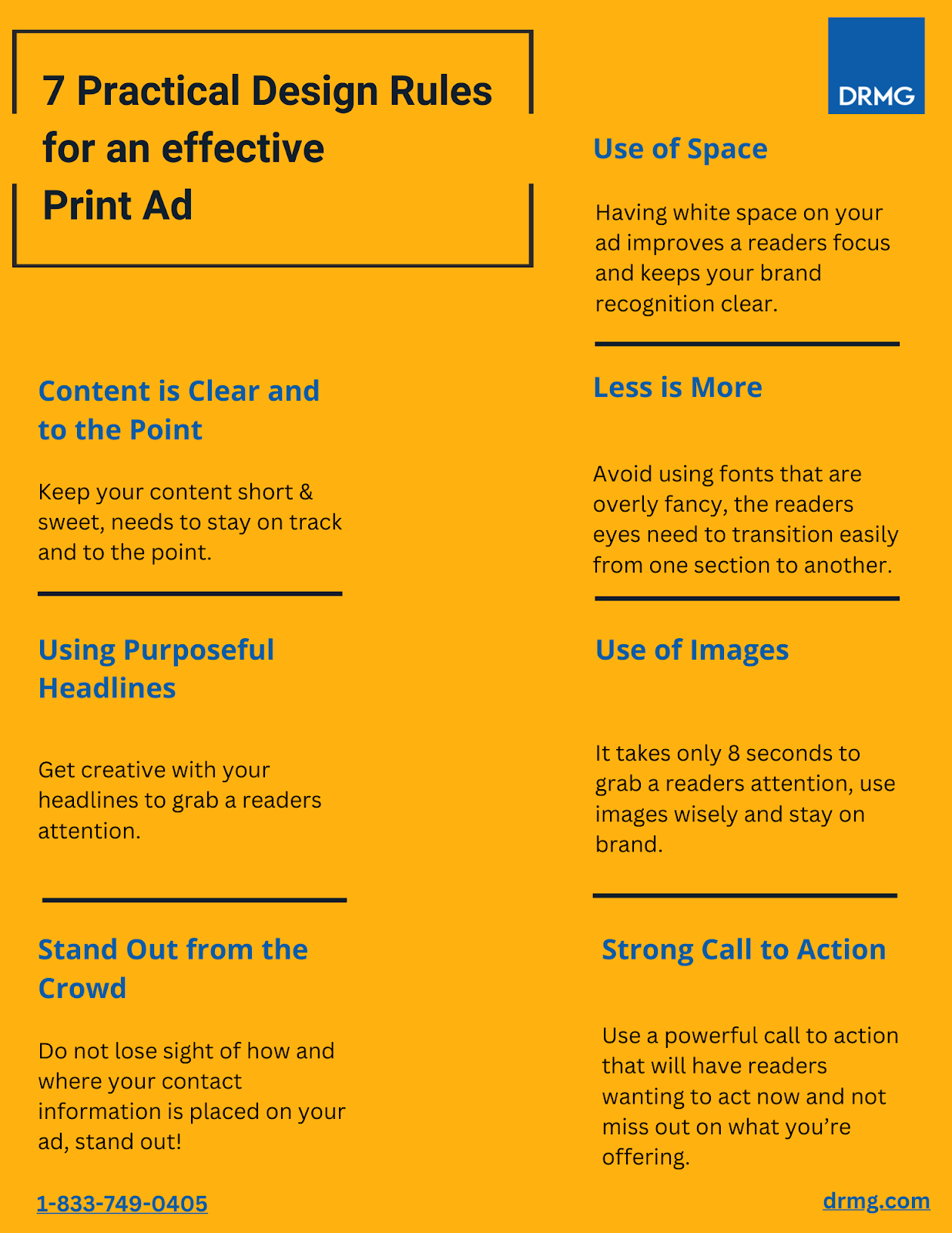
Generally speaking, it’s best to keep all messaging short and sweet, and stay on track and be right to the point. If the message is verbose, has run-on sentences, or is confusing, your message will be lost and the would-be consumer will disregard your pitch.

Paint a Picture in Consumers’ Minds
Consider the words you’re using carefully and rewrite descriptive text using Word Hippo, an online thesaurus you can use to find synonyms for every adjective. What kind of impression do you get when you read the descriptors? How do the words make you feel? Remember, you want your sales pitch to appeal to your readers’ emotions and push their persuasion buttons. Using words like 'cozy', instead of 'small', or 'colossal' instead of 'large' can produce more vivid pictures in your readers' minds.
Play on Readers’ Curiosity
Does your product have a real-life story, or a human-interest angle with universal appeal? Are there important facts or fresh new data you could include that would impress your target demographic? Good marketers tease out facts to make their wares more relatable, and they pique their consumers’ natural desire to learn more about their business.
Do’s & Don’ts of Print Ad Headlines
The backbone of your print ad is its headline. This is what most people first perceive and its shape, tone and message will frame their experience going forward. This primary input is where most marketers place the opening pitch, although veterans will caution rookies not to 'give it all away' in the headline. Regardless, don’t waste this space trying to be friendly. Don’t start with, ‘Established in 1982…' or, ‘Welcome to the Neighbourhood', or something similar which has low impact on readers. Cut the crap and tell consumers what you have and how it benefits them as quickly as possible. Do craft powerful headlines with active verbs, concise language, and add jazz to familiar words with one or two delightfully unexpected descriptors.
The 4 U's Formula for Writing Print Advertising Headlines
The 4 U's Formula is a popular and effective method for writing print advertising headlines. The four U’s stand for Useful, Urgent, Unique, and Ultra-specific. A good pitch line should have at least one or two of these elements and a great headline will have all four considerations. The more effective and attention grabbing your headline is, the greater chance of reaching prospective clients will be with this preliminary qualifier.
Less is More in Print Media
While it’s fun to use lavish fonts, and a rainbow of colours , keeping it simple and legible is another way to maintain ease of reading. Avoid font styles which look fancy but where the recipients will have to read twice to understand.
Serif or sans-serif fonts?
Serif fonts like Times New Roman, Garamond, Cambria, and Georgia are commonly used in print media, but can look cluttered, outdated, and boring when used in adverts, depending on the context of your offering. Serif fonts can also clash with other design elements, such as images, colors, or graphics if they are not well balanced or harmonized.
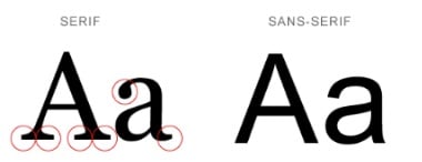
Sans-Serif fonts like Arial, Roboto, Tahoma, and Verdana are favoured for online media because they’re deemed easier to perceive on screen. Sans serif fonts carry the spirit of fresh innovation and a friendly informality, which appeals to certain audiences. But on the other hand, sans serif fonts can also seem too casual; the style is considered too informal and appears unprofessional when used in legal documents, resumes, thank-you letters, or contracts.
White Space Helps Print Ads
Big businesses and brands often pack their print advertising with countless details and curious features. They have market share and can maximize the space allowed without much risk of making a messy ad which repels consumers. Small brands and entrepreneurs would be well advised to produce more spacious offerings. Ads with lots of white space are more comprehensible. This means you should add more space than what you’d normally feel is necessary, especially around your value proposition and call-to-action. Having white space on your ad improves the legibility of content and brand recognition.
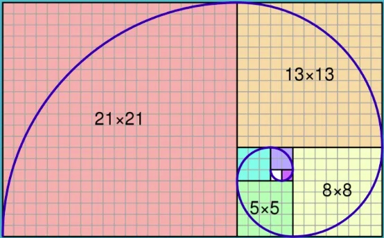
Consider the Golden Ratio when Plotting Layouts
Good design is all about managing and dividing space. The Golden Ratio is a design concept used throughout history to create visually appealing proportions in art, architecture, and design. How did this pattern become so venerated? The sequence is commonly found in Nature. This pattern is visible in ornamental shrubs, the flowering of artichokes, and the arrangement of certain tree leaves, to name some examples. Human brains have an affinity for this seemingly random pattern.
Best Images for Print Ads
Depth of field, colour, and visual messaging are all important factors when selecting images for print ads. Image resolution is also worth considering.
DPI stands for “dots per inch”. Good marketers select images that are at least 250 - 300 dpi for their print ads, but are far less discerning for online advertising where high res pictures are slower to load. Online ads can get away with a lower dpi of say 72, but in print media, consumers appreciate seeing higher quality images, especially images of food, fashion, and travel destinations.

Engagement is amplified when consumers see themselves in the ads. Much has been written about the value of showing human faces in print advertising. Visualizing people who are emotional is always engaging because we are all human. Our brains are hardwired to wonder what exactly produced the emotional response we're seeing in the pictures.
Use images that don’t require deciphering and stay true to your product or service especially when trying to communicate a complex message. Original photos are always better and royalty free stock images are perfectly acceptable provided they relate to your brand.
Ensure Consumers Can Contact You
People get excited when they receive deals for products they already enjoy - that's like money in the bank. But nothing is more frustrating to them than having a question, or some valuable feedback about a certain deal, but no clear way to contact your business. Even if this was an oversight like a missing phone number, email, or web address, if the customer can't figure out how to get in touch with the vendor, all your efforts are at risk.
This is where you can really stand out from the crowd by utilizing your contact information in the best way possible.
If you’re a takeout business, only your phone number needs to be front and center, but if you expect customers to visit your brick and mortar venue, your address needs to be prominently displayed, and if it’s a difficult location to find, adding a small map won’t hurt.
Instill a Sense of Urgency
The best print ads invoke a sense of urgency in the consumer which amplifies the call to action in the original message. Something that makes the customer want to act now and not miss out. This can be a limited time offer with an expiry date, or a special add-on with the purchase of XYZ. Or it could be as simple as saying, while supplies last, or the first thousand customers through the doors will get a bonus.
When your business takes the time to properly execute and utilize these design rules, there’s power in just how effective it is for brand awareness and driving sales. Direct Response Media Group not only offers exceptional design services, but our Marketing Consultants can provide you with the solutions you need to get started, or refresh your campaign! Contact us today if you’re ready to follow the rules.


Comments